Haymkt Books is as a radical, independent, nonprofit book publisher founded and run by activists. The mission of this rebrand is to activate the public and readers with motion and urgency in order to call attention to the many important topics the publisher covers.
CONCEPT & LOGO
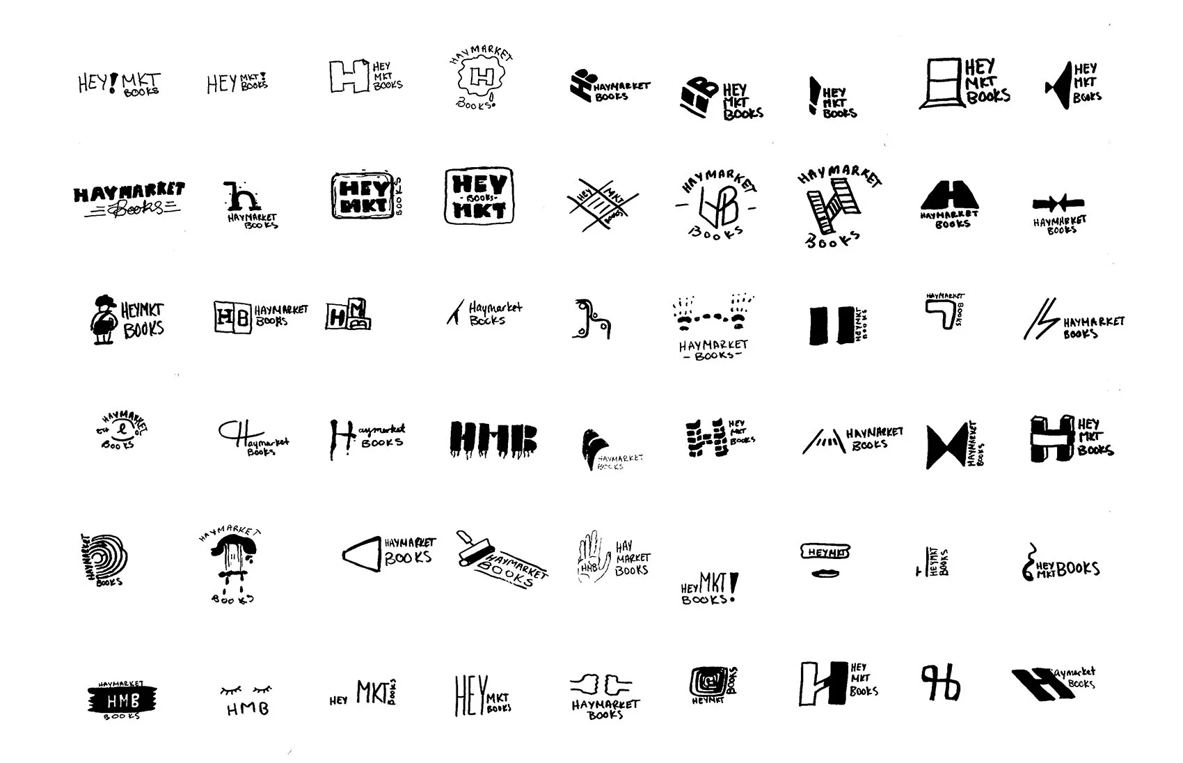
The logo needed to be impactful at a quick glance yet dimensional in its message. I played with braking up the word “Haymarket” and the exclamation “hey!”, which eventually evolved into an exclamation point, embedded within the logo itself. The purpose is to call attention to the brand’s mission while simultaneously representing the voices of the marginalized groups it represents in its published works.
MOVEMENT
Led by activists, this publisher is all about motivating the public to be educated and to take action to improve society. This became the primary concept of the brand’s new identity. The mark I created is flexible and reshapes itself to fill its container. It’s all about occupying space to make its presence known from business cards to the spines of books to posters and billboards.
COLORS
PATTERNS
Books/Fabric: knowledge is strength and power. Used when referring to the brand’s published material.
Ripples/Waves: the call for positive change. Used when referring to community events focused on connecting people and sharing information.
Marching/Building blocks: the collective force taking action and making change. Used when referring to taking action such as participating in marches or contacting local officials.
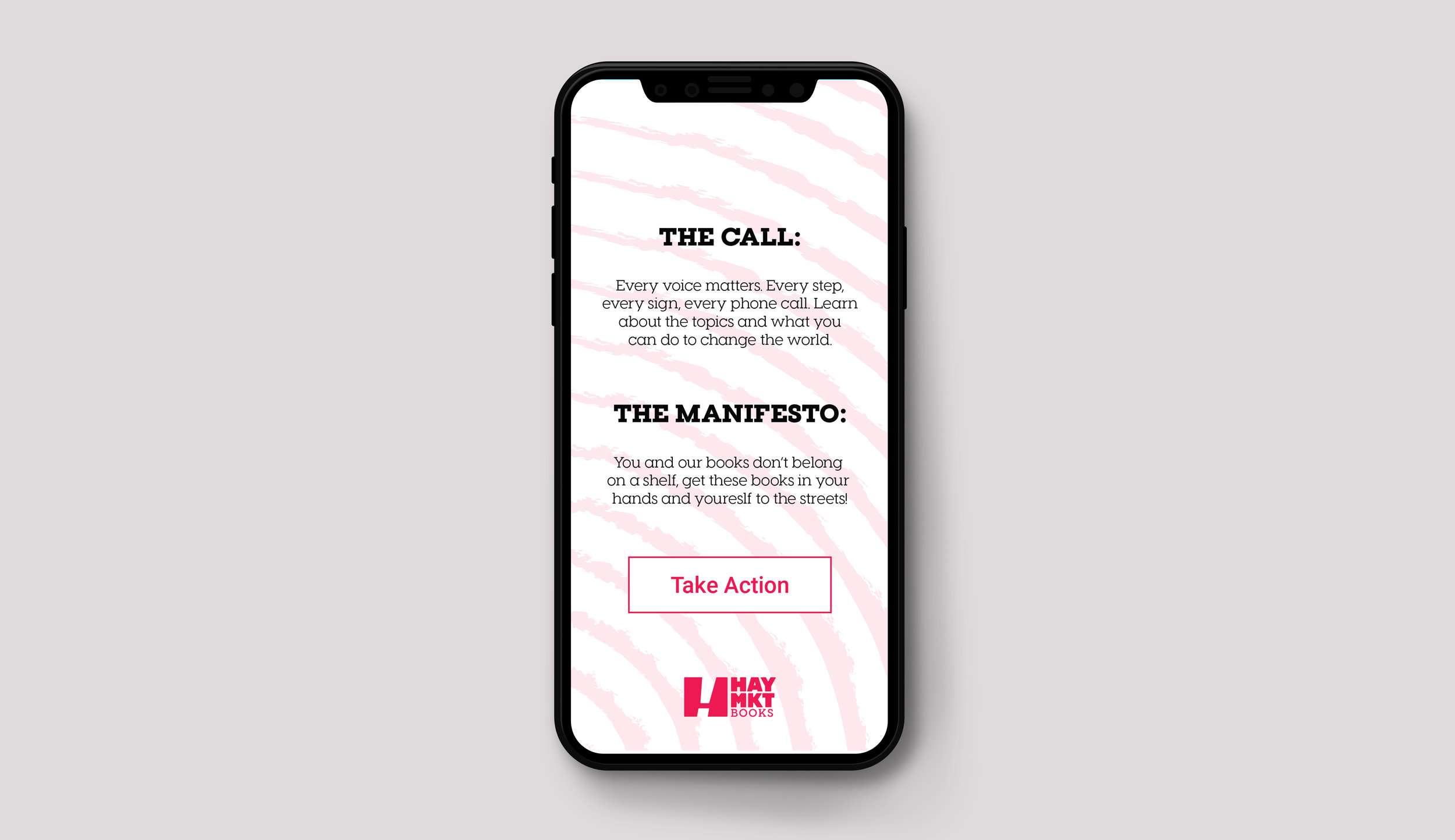
THE APP
I created the Haymkt app to give readers a central hub to educate themselves on the issues facing society and to attach a sense of urgency to taking action on these issues. The app is a tool to connect users to information, people and events, whether you are a stage 1 activist (interested in learning about a topic), stage 2 (finding and connecting with others who share views), or stage 3 (ready to take action to make a change).


